
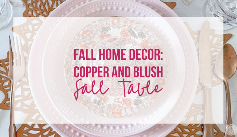


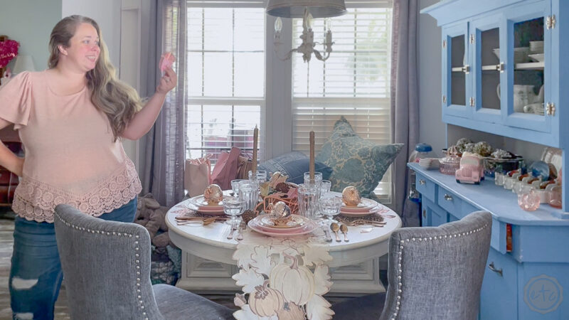
It’s that time of year again… the weather is turning crisp and the leaves are starting to fall. Which means it’s time for another fall tablescpae! This year we’re busting out the copper and working on a copper and blush fall table. It’s actually similar to the blush and rose gold tablescape we did last year although with a bit of an updated twist.
New fabulous rose gold paper acorns for the centerpiece and a few new touches like the dessert plates and copper flatware.
I am completely obsessed with how it turned out… let’s jump right into it!
Supplies:
- Blush Pink Dinner Plates
- Blush Pink Salad Plates
- Copper Flatware
- Clear Ribbed Highball Water Glasses
- Copper Maple Leaf Placemats
- Fall Leaf Table Runner
- Thankful Script Words
- Metallic Acorns
- Rose Gold Glitter Tapers:
- Clear Candlesticks:
Step 1: Pick the Focal Point of your Tablescape
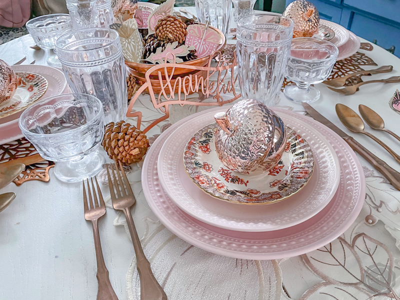
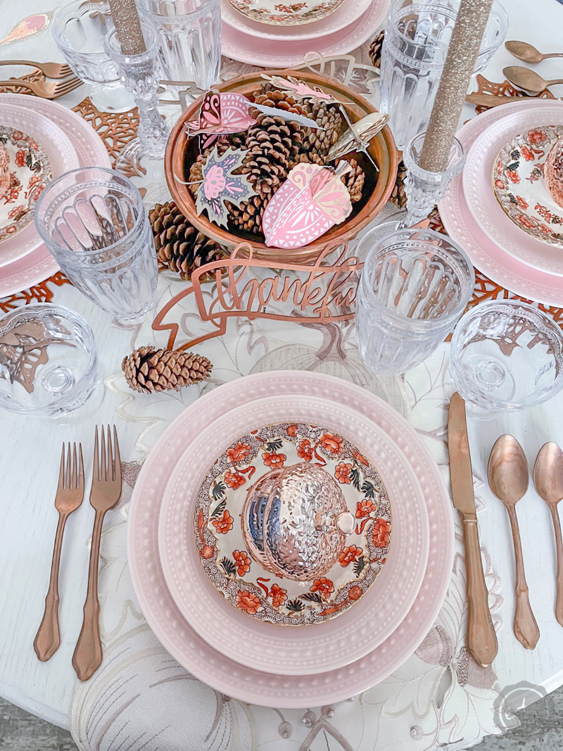
This table is very similar to last year’s table with the same color palette (except I swapped the shinier rose gold for a deeper copper). But I still layed down the same base for my table: a detailed leaf table runner, copper leaf placemats and pink dinner & salad plates.
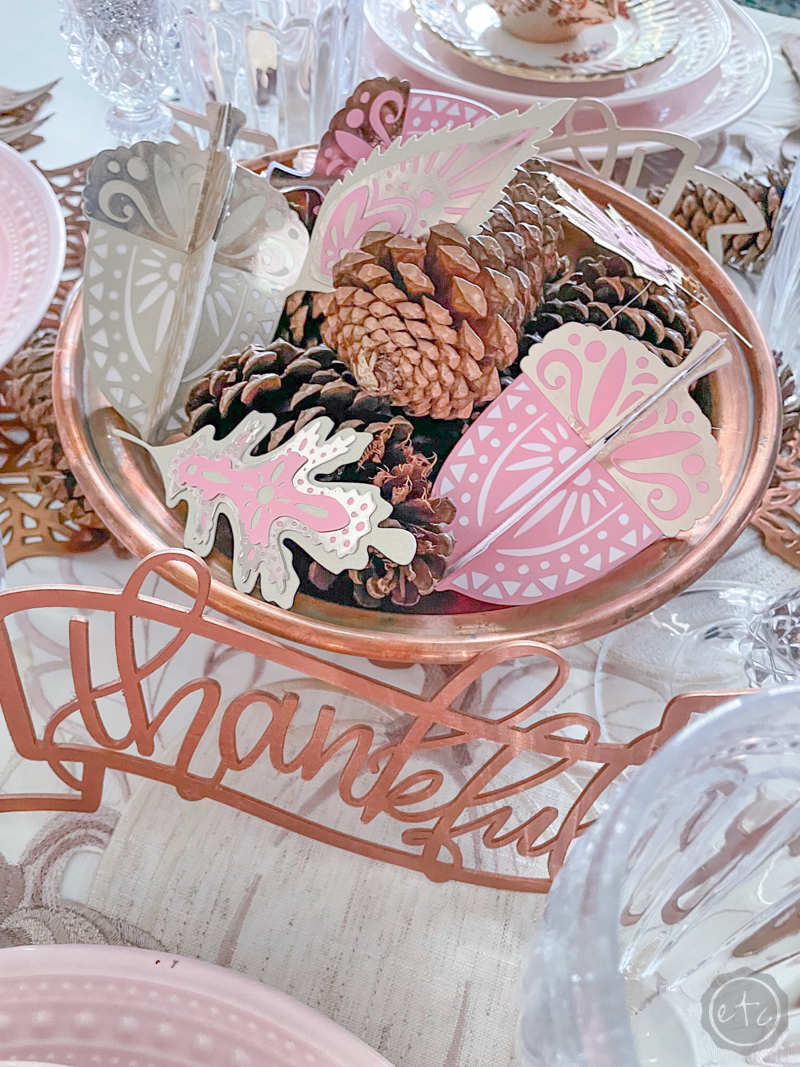
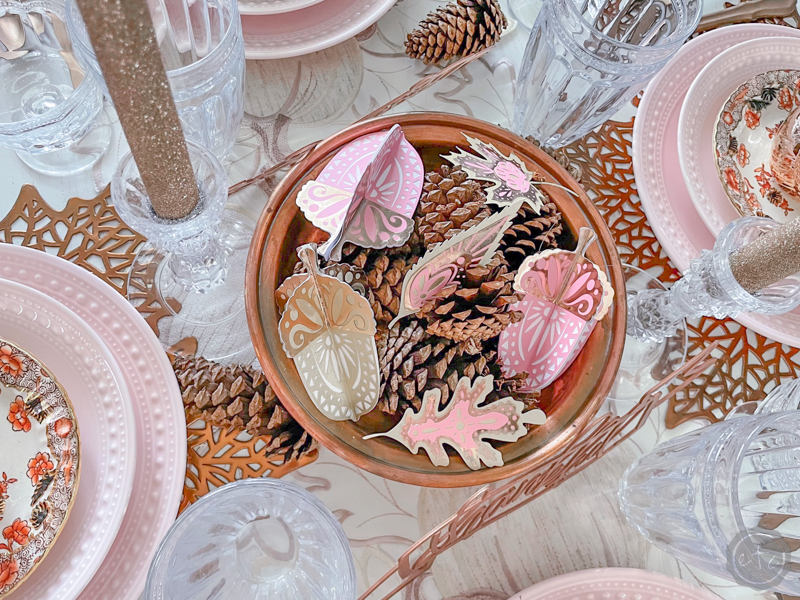
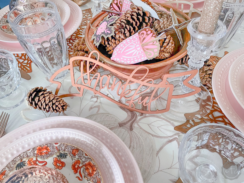
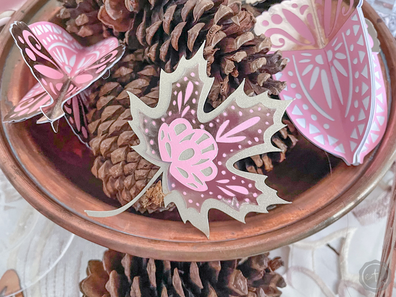
From there I decided that the new paper acorns in my centerpiece were going to be the focal point of my table. I wanted to showcase them and let your eye rest in the middle of the table. So instead of grabbing blue glasses to complement Mom’s dessert plates I chose clear glasses that take up less visual weight.
It’s a fun little trick I picked up that helps to show off whatever it is you’re working with. They’re still beautiful glasses but they don’t draw your eye.

Step 2: Use Coordinating Metallic Colors
Since most coppers, rose golds and champagnes aren’t the same color I often add similar metallic colors that all go together. For this table I tried very hard to stay with the darker weighted copper. I used dark copper leaf place-mats, beautiful copper flatware and even an antique copper colander as a base for my centerpiece.
From there I did layer in a few coordinating metallics to draw it all together. Things like the rose gold glitter taper candlesticks, shiny metallic acorns and the cream and champagne table runner. They are metallics but with the darker copper grounding the space the champagne and rose gold read almost as neutrals. And while they read as neutrals they still add a bit of dimension to the space… and that’s the goal.
After all layers of color add dimension that help your eye move around the space.

Step 3: Add the Finishing Touches
From here we only had a few more pieces to add to our table. A beautiful antique desert plate from my Mom… literally she came over to help me set the table and brought these with her.
They ended up working beautifully with the other metallics on the table and add a warmth I really enjoyed. Speaking of warmth I used quite a few real pine cones to prop up my metallic acorns in the centerpiece. These little babies coordinated nicely both with the darker cooper and the orange in the dessert plates… I think they were a nice bridge between the other colors and helped to pull the space together.
Last but not least are the roes gold thankful script words I cut out of basswood with my Cricut for last year’s table. I went back and forth on whether these were tooooooo much but without them the centerpiece looked un-finished. I love that they’re open so that they don’t take up too much visual room on our already busy table.
For me, they’re the cherry on top of the sundae.
Just a tiny crowning jewel.
Ready to see the rest of the table?

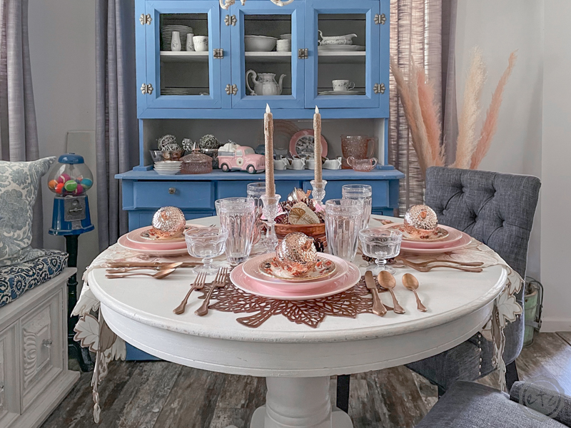
I absolutely love how it turned out! It’s such a glamorous table and I love every single metallic layer.
I hope you enjoyed it… if you did don’t forget to pin the following images for later. See you next time!


Leave a Reply