
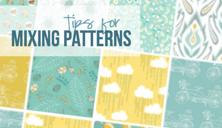

When browsing Pinterest for tips on working with pattern I come across the same tip over and over… What is it? When in doubt mix: one large print, one geometric print and one mini print.
Flawless.
Good solid advice.
I have never once followed it. I’m not saying that scale isn’t important or that I don’t pay attention to it. If I have three large prints I’m going to add a small print before a fourth large print! However I don’t go around every single room checking off various prints: I have a large print! Check! A small print? Check! A geometric print…. Oh no I need a geometric print! Quick lets go to TJMaxx!
So what is my number tip for mixing pattern?
Stick within a color family!
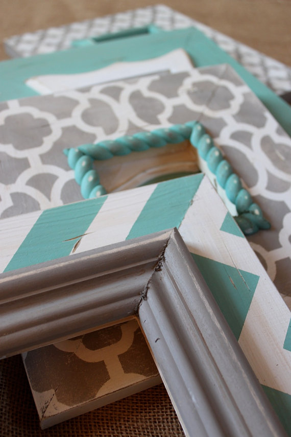
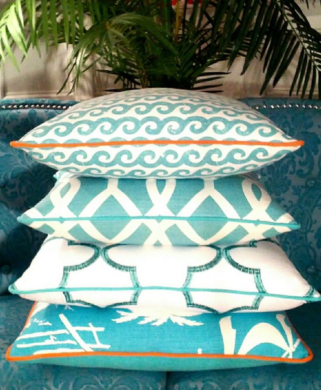
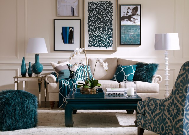
See what I mean? Each pillow, bowl and picture frame has a different pattern… but since they all utilize the same pattern they still mesh perfectly! When mixing pattern start with a color scheme. Whether that scheme has one color or 12 is up to you but set the colors from the beginning. Then you can choose patterns that work within your color scheme.
They’re guaranteed to work together!
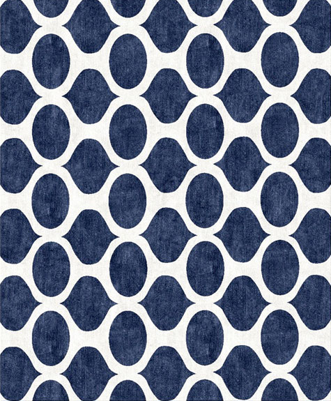
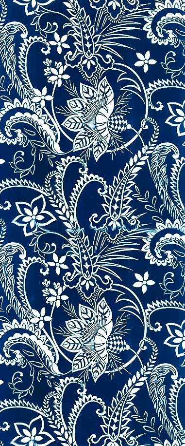
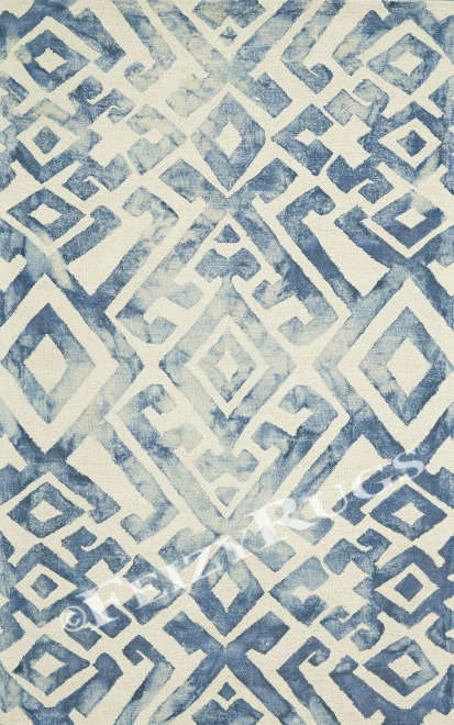
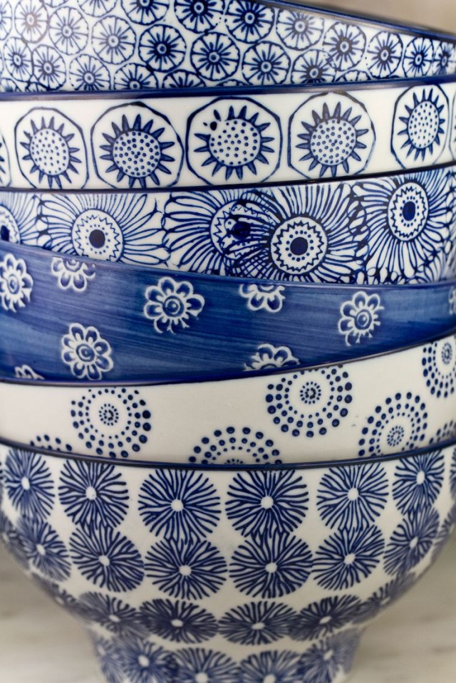
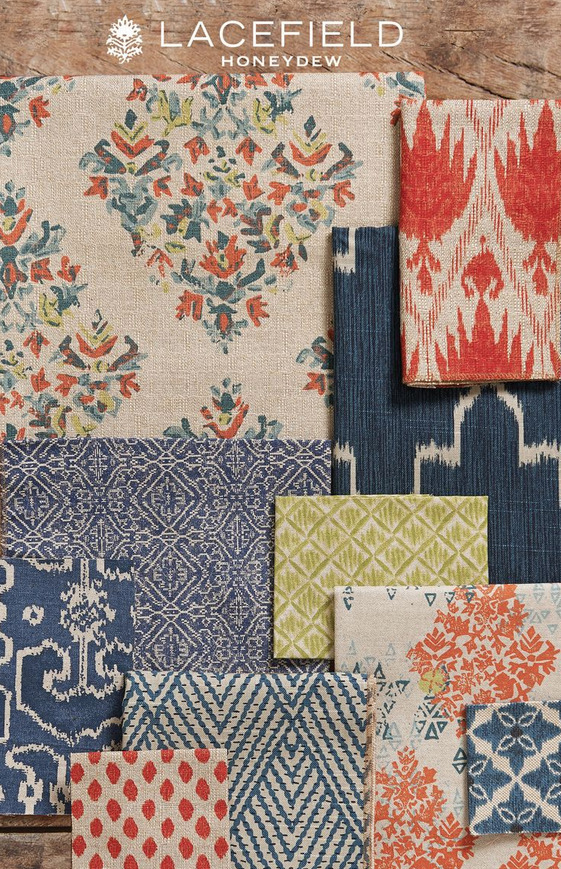
See how well these three blue fabrics work together? By choosing a dark blue color in three varying patterns they all coordinate! That’s the goal here y’all coordination not matching! “But Betsy, the third fabric is a slightly lighter blue”. That’s okay! As long as the hue remains the same (notice it’s a lighter version of the darker blue color, not teal) the variation in hue will add a nice bit of depth. If you’re working with a monochromatic color scheme where you only use one (or even two) colors varying the hue is a great way to add interest to a room.
My favorite trick is to pick one statement piece first. Pick something your heart loves and work from there! Your piece will give you an automatic jumping off point… does it have three colors? Choose a solid couch in color number one, throw pillows with color number two and a fun ottoman with a mix of one, two and three!
The only downfall? Once your husband gets a hold of your color scheme he will think the idea is to buy EVERYTHING he sees in that color. He will not understand that the point is to pick pieces in those colors that you love and look great together. Nope anything blue will work. I don’t know how many times I’ve heard him yell from the next aisle over “Honey, I found something in that shade of blue you like… let’s buy it!”.
 ]
]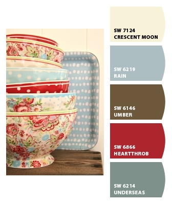
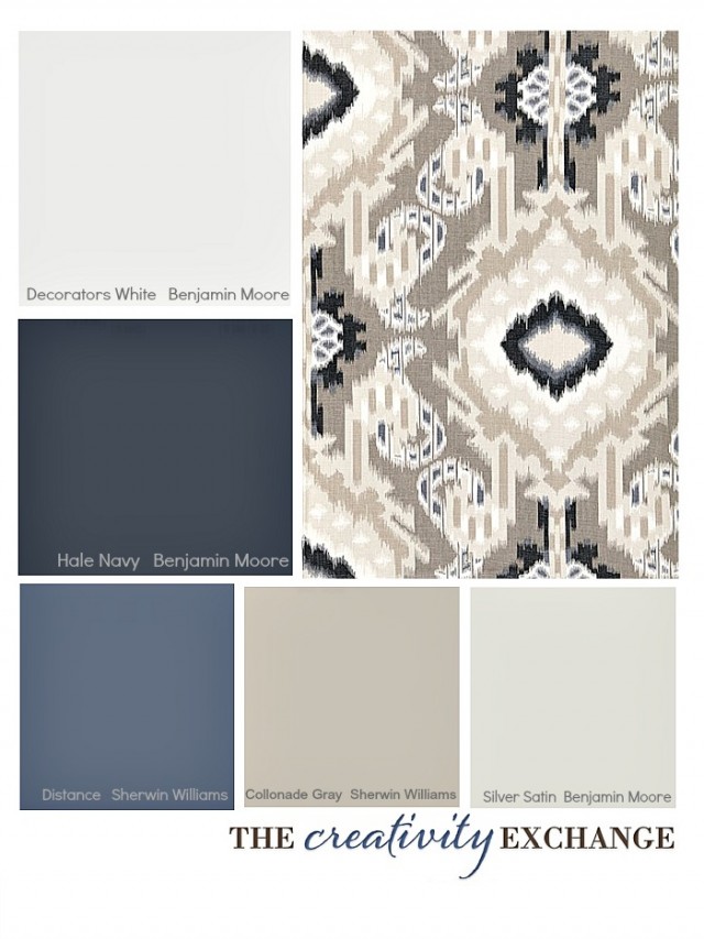
If you would like to make your vary own color palette you can use a nifty little website called Chip It!. Simply upload a picture of your very own statement piece and Chip It! will pull colors from your photo for you! The best part? It’s a Sherwin Williams based website so the colors coordinate with their paint! Do you want to paint your walls in a coordinating color like Rain from the photo above? Simply tell your friendly Sherwin Williams employee to mix up a gallon of SW 6219. You’ll be all set.
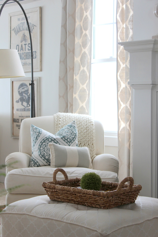
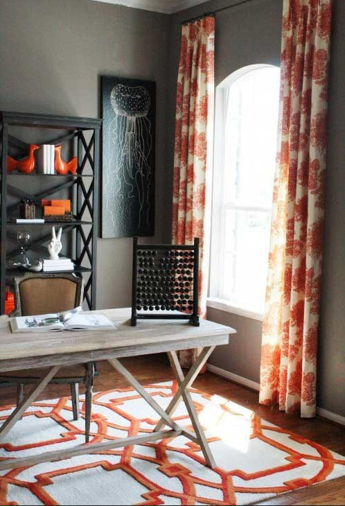
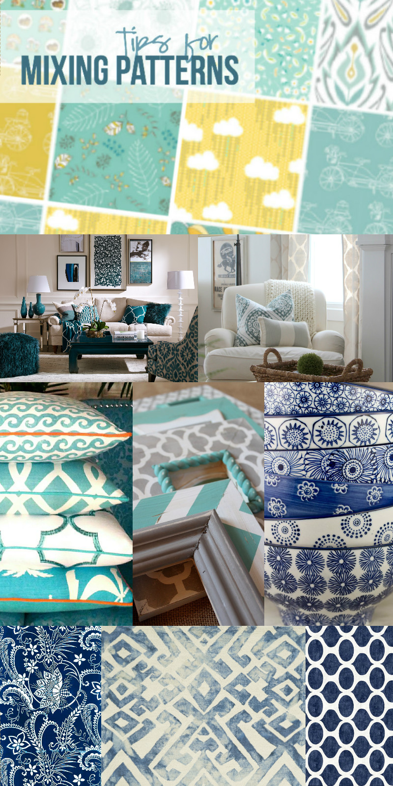
Mixing patterns is something I still work on everyday, I tend to stick towards solid pieces that are textured. I don’t know why but texture always draws my eye first! That’s great and all but a room full of solid colors in the same hue starts to fall flat. By mixing patterns in the same color or varying hues I am able to mix patterns like the pros. (Or at least that’s what I tell myself). Before I go here are a couple pictures of rooms that are just bursting with gorgeous patterns. A little eye candy if you will.


Hi Betsy, thanks so much for bring this post to Fridays Block Booster Party. This mixing and matching is such an art form, I need all the help I can get. I would like you to share more of your posts next Friday.
Kathleen
Thanks for stopping by Kathleen! I’m so glad my post was able to help you! See you at the party next week!
Wow – I’m so impressed. I would never be able to put these patterns together. And the combinations are awesome! I pinned this for later because I’m a scrapbooker and often am challenged with mixing patterned papers. Thanks for the tips – they’ll definitely help the artsy-challenged like me. 🙂
So glad it helps! I love to scrapbook… but it always turns into a giant mess as I try to spread out all of my supplies in one giant pile! Haha! I started organizing my supplies by color and then by category and that definitely helps… makes matching a lot easier! My favorite line is “My Minds Eye” most of their supplies coordinate so that helps with the whole mixing and matching thing as well!